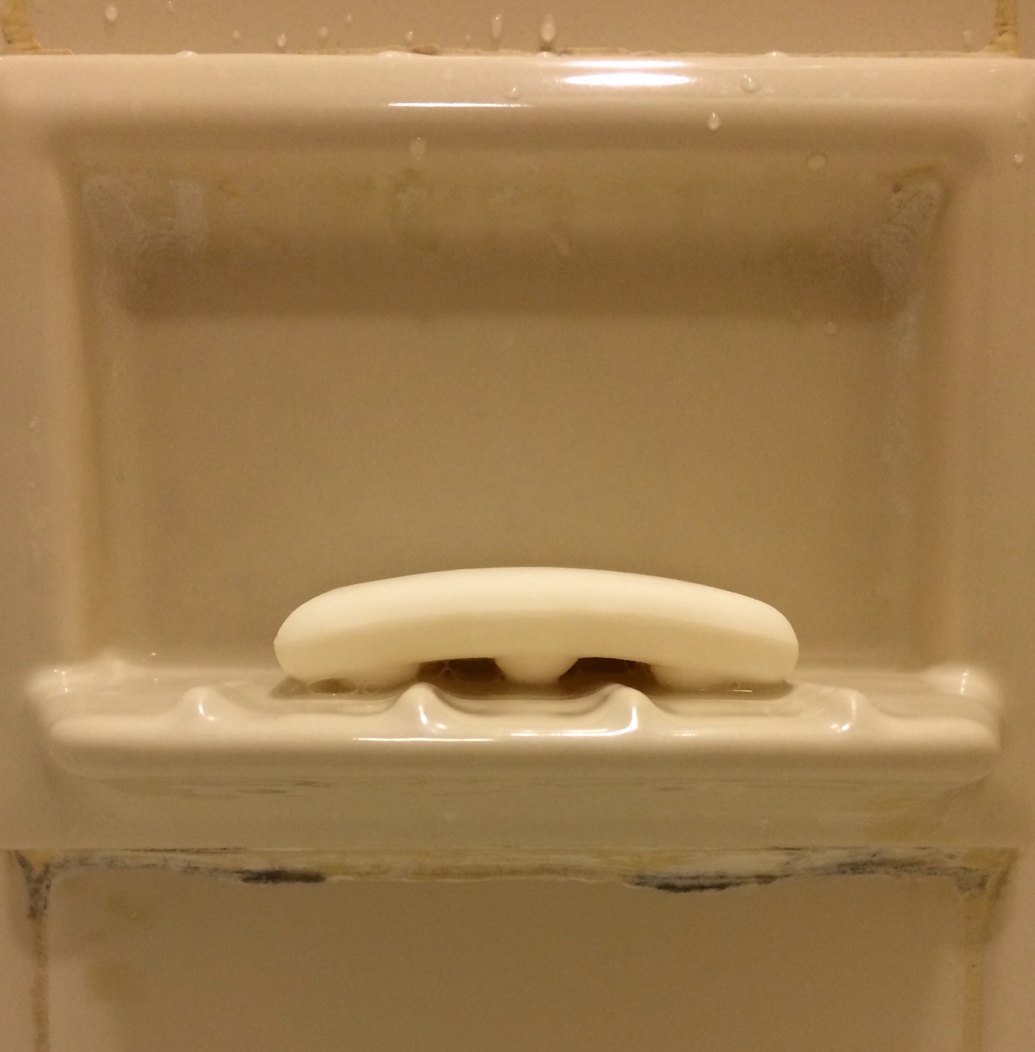
 A reader in the Pocono Moantains found a bar of soap in her hotel room which perfectly matched the ridges in the soap dish. Another example of coordinated hygiene product evolution? A design which permits the soap to fall off the shelf in one specific orientation? A little bit of visual aesthetic to get your morning started off right?
Thanks to Beth for noticing this and sending it to chickenmonkeydog! If you see something quirky to share, please do!


Did they use white caulk to hide potential mold growing? That seems unsanitary.