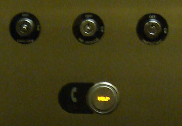
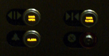
The elevator in which I was riding, like most elevators, had Braille written next to each button to accommodate blind passengers. In evaluating the design, I discovered a potential issue.

First, here is how the button panel is set-up: The “Help” button is located at the top of the buttons and has, in addition to Braille, a picture of a telephone. I wonder what the writing next to the Help button says – “Help” or “Call” or “Telephone”?

Second, the “Alarm” button is located at the bottom of the buttons and has, in addition to Braille, a picture of a bell.
Shouldn’t the Help and the Alarm buttons be located closer to each other so that a blind passenger doesn’t waste time reading all the buttons trying to find the relevant buttons in an emergency?


Excellent observation. I would suspect that with all the elevator regulations in place, this is probably not an accident of design, but an intentional decision. I don’t know why that would be though.
In a related question, are their devices available to translate electronic documents and web pages into braille?
@ Conall
Here is something I found.
http://www2.edc.org/ncip/LIBRARY/vi/output.htm
This observation is right up there with Braille on drive-thru ATMs. It’s all a big mystery…or conspiracy.
@ Conall,
Regarding your “intentional design” theory, I beg to differ. I have ridden 2 different elevators since this was posted yesterday and neither had buttons set-up the same way and neither matched the set-up mentioned here. That would lead me to believe that things are not as regulated as we like to think…
Are there any elevator engineers reading CMD who can clear this up?
@ Conall,
There are programs that will read out the content of web pages so that the blind can hear them.
Also, most computers come with some sort of accessibility tools. If you’re on a PC, check out All Programs > Accessories > Accessibility (in Windows XP … God only knows where they put it in Vista.)