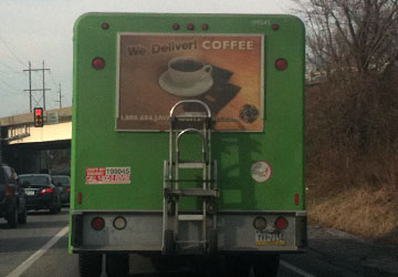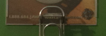

Returning from an errand the other day, I was following a beverage delivery truck as a I pulled up to a traffic light. In reading the poster on the back of the truck, I thought it was an important marketing message to share: the soda delivery service also includes coffee. However, when I glanced down at the contact information to see which company was offering this well-rounded service, I was disappointed to see those details obscured by the delivery dolly.
As you can see in the image (apologies for the less than stellar image quality), the dolly is held in place via a slot for the dolly shelf and a strap across the upright handles. This set-up is part of the truck’s design — the dolly was not simply strapped onto the back at the whim of the delivery drivers.
It seemed to me that the poster designers failed to understand or compensate for the medium in which their marketing message would be displayed. (In fact, there is no company name on the back of the truck — and I turned off before I had a chance to see the side of the truck.)
#marketingfail


