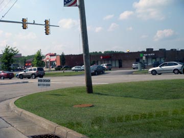
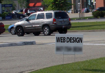
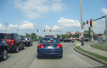
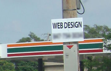
On a recent trip through the Midwest of the USA, I saw a number of road sign placards offering web design. The placards were stark to the point of lacking in design sense. They were placed on a number of different intersections across the north west suburbs of Chicago. The signs also included a telephone number which I blurred in the following images.
Take a look at these two photos (one is a close-up) of a sign at one particular intersection.
And here are a couple more pictures of the sign posted at a different intersection.
So, at the risk of sounding terribly egotistic, does do these particular road-side advertisements stir in you a desire to ring the number about your upcoming web project?



And somewhere a baby unicorn is crying…
“do theses particular” in the last paragraph.
@ Jordo,
#?£$%* it! Every time we think we’re so much better than everyone else in the world, we screw up and fall flat on our face. Thanks for checking our ego.
[…] it worked for web design services, who’s to say it won’t work for SEO? Recommend on Facebook Tumblr it Tweet about it […]