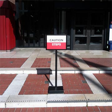
It seems a design failure when a caution sign is required to advise people coming into the building’s main entrance that steps are present.

It seems a design failure when a caution sign is required to advise people coming into the building’s main entrance that steps are present.
There does seem to be some optical illusion stuff going on here as the steps are not real obvious.
But who am I to say anything… I can’t walk through my house without running into something.
Got to love that the caution sign continues to play with the same colors and shapes as the optical illusion created by the stairs!
Red and white rectangles everywhere. Where is the riser and where is the run!?
And where is the “Caution Sign” sign. That is a law suit waiting to happen.