Over the summer, I enjoyed a short holiday on the Isle of Wight. Whilst driving from one corner of the lovely island, to another scenic corner, I stopped at a traffic light. Glancing out the driver’s side window, I encountered the following sign:
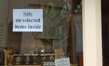
And I thought to myself:
“No s***?!”
“Have a sale on selected items inside the shop? That’s brilliant!”
“Who would have ever thought about putting selected items on sale? What a stroke of genius to post such a witty, clever sign? Truly this is going to pull the carpet right out from underneath the competition.”

Give the shopkeeper credit for trying. He/ she is trying to create (an artificial) scarcity and desire for what people can’t have. People will come in and presumably drool over things not on sale. He/ she can then negotiate with them extortionate prices (who knows the extra margins will even pay for the discounts hence lower margins on which the ‘selected items’ are being sold). What say?
PS: This is a very ‘GNU is not Unix’ type of post 🙂
If they had a sign at the top stating that it was a store, I think you could have gotten the same message across. I can only imagine the boss telling some poor lackey to go ahead and make a sign, have it say……
@ Shefaly – I can certainly give the shopkeeper for trying something. Sure enough. But I would have thought that devoting a wee bit more thought and effort to the sign’s phraseology would pay better dividends. Even a simple sign announcing only ‘SALE’ would have been a better choice.
@ Mark – Your thoughts mirror my initial reaction indeed.
@ Liam
Marketing is all about creating a desire – for things you don’t need. I think the ‘suspense’ works brilliantly. Almost always the best things won’t be on ‘sale’ and once you are in, you are as good as ‘sold’ on those things 🙂
Now that I think about it, I actually saw a sign that conveyed the same concept as the one posted in the photograph….it said “Open”
@ Shefaly – Hmm … I am just not convinced that the sign packed sufficient impact to drive foot traffic into the shop. (I wasn’t interested in parking and going in.) As the traffic light changed to green seconds after I snapped the photo, there’s no way to know for sure how well it worked …
@ Shefaly
I’d even suggest that this sign is far LESS effective than a simple “SALE”, because when I see “selected items” I immediately assume that the selected items are NOT going to be the good ones, which I want.
@ Liam
You are using too much logic 🙂 If you, like me, aren’t the kind who buys ‘buy more save more’ type of nonsense (I despite or perhaps because of my marketing major…), you are unlikely to walk in anyway. Some people see a ‘sale’ sign and just go in, as if led by the Pied Piper. Once they are in, they will almost always find that the shop’s layout makes them confuse the boundaries between goods ‘on sale’ and ‘on sale at regular prices’. Once you take a thing to the till, you will pay*. It is a sign that is used quite often which suggests that the ruse works – and not just on Isle of Wight but on Regent Street in London too.
*Unless you have no embarrassment, like me, in which case you will say, Oh that much? No thanks. 🙂
@ Shefaly –
Fair point on the ‘sale’ sign as a beacon to those who ‘spend to save’. Good point – and one I probably didn’t give enough credit.
And, I have occasionally walked away from a purchase at the till when the price was different than the display price — but only when the difference was significant or if I felt the discrepancy was a deliberate ruse.
@ Liam
Hedonistic versus utilitarian shoppers – they are aiming for the former kind, you and I are the latter kind. 🙂